
UNDERSTANDING THE P6 BAR SPECIFICATION
ORACLE PRIMAVERA P6
DOWNLOAD THE PDF HERE
Overview
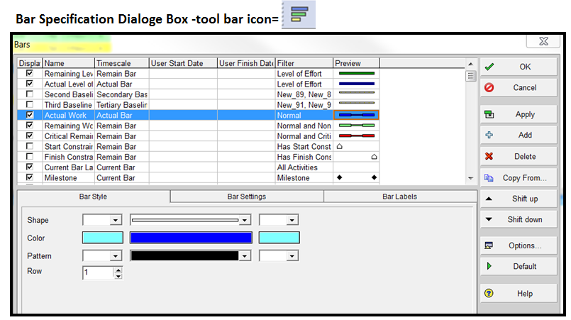
The Gantt chart is a basic tool for graphical display of schedule timing and activity phasing. P6 plots the start and finish of activities on a choice of timescale periods depending on your reporting needs. There are basic default bar options for colors, shapes, labels and other bar specifications. These options are set in the bar specification dialogue box (see below). This dialogue box has many options and can be customized for several graphical results such as coloring bars by codes, plotting multiple bars on one row and many other possibilities. This topic explains how the basic P6 bar plotting function works and explores advanced use of the bar specification for the activity window. (Note: There are some differences in the project and tracking window bar specifications).
 The items (bars) that checked in the “display” column above are plotted in order from top to bottom of the list. By design, different bars/ labels will plot on the same activity and if not planned properly, could overwrite each other.
There are many settings that impact the bar plotting and because of this, the bar specification is probably one of the more complex inputs into P6. However, it can be very powerful for plotting bars and creating custom displays. This method for plotting bars has been a staple of Primavera for years.
Any changes to the bar specifications and settings are saved in a layout. If you create custom bars, an associated layout is advisable.
How bars are plotted
Before considering the many options within the Bar Settings, it is important to have an understanding of how the P6 program plots the bars. As shown in the example bar dialogue box above, there is a listing of many types of bars. The first column is titled “Display”. For every row or type of bar that is checked as “displayed”, P6 plots all of these bars in order starting from the top and proceeding to the bottom. It can be thought of that the program considers each line (bar type) as a separate bar plotting instruction. It plots that instruction and moves on to the next line in the list. There can be multiple plotting instructions that apply to the same activity. For example, the most common bar on a Gantt chart (as shown below) uses 3 separate plotting instructions (lines).
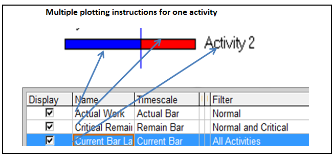 Using the example above, for every activity that fits the bar filter, P6 plots 3 “bars”; (1) The actual bar plots from the actual start date and the actual duration, (2) the remaining critical bar plots the early start date and the remaining duration and (3) finally, the bar label is a separate plot instruction which in this case is located at the finish of the current bar. Note; labels could also be placed on the actual and critical bars but they are not because as would result in overwriting of the labels and placement on some, but not all activities. This will be discussed in more detail below.
Some activities may have multiple plotting instructions and other activities may be controlled by one specific instruction. The “Timescale” and the “Filter” together define the activities which use any bar instruction. There are some default filters in P6 that cannot be changed by the user. One of the reasons for these default filters is that they are associated with the default or normal bars on the standard Gantt charts. Bar Timescale and Filters are described in more detail in the section below. When customizing bar settings, it is up to the user to define bars that will plot correctly; which means that bars will not overwrite each other and appear in chronological order as desired.
Bar Settings
The Bar Specification dialogue box can be opened from the layout options menu, the tool bar or several other locations in P6. The bar dialogue box generically shows a list of different types of pre-set bar specifications depending on the layout. The bar lists are specific for each layout and any changes are saved in the layout. The pre-set bars in the P6 “Classic WBS” layout are shown the initial example above.
Each line in the bar box contains bar data in 6 columns and in 3 detail tabs below. Thus each bar specifications have the following possible inputs:
Display – A toggle that indicates whether or not the bar is plotted or displayed on the Gantt chart. If it not being used, it could be deleted. This can be helpful to simplify the display.
Name – The name of the bar which is customizable and is used in showing a legend on charts. Thus if you have terminology for the bars that you want to use on a legend, you can use your terminology and do not have to use the P6 defined names. For example: P6 uses “Baseline” and you could call it “Project Original Baseline”.
Timescale – This setting defines which dates are used for plotting a selected bar specification. There are some basic options and some more complex or less used options. By clicking in this column, the following timescale bar options are listed:
% Complete Bar – Plots the start date to a finish that equals start date plus (activity % times duration). Thus it colors in a percentage of the bar to show ahead or behind in comparison to the data date.
Actual Bar – Plots the early start and late finish.
Current Bar – Plots the Start and Finish date (P6 Start/Finish reflect actual dates when recorded or early dates if no actual date).
Early Bar – Plots the early start and late finish. Note; the early start is the data date once an activity has started.
Float Bar – Shows positive float by plotting a bar from the early finish to the late finish.
Late Bar – Plots the late start and late finish.
Neg Float Bar– Shows negative float by plotting late finish to the early finish (remember when there is negative float the late finish is before the early finish).
Performance % – Plots the start of the bar to a finish that equals start date plus (performance % times duration). Thus it colors in a percentage of the bar to show ahead or behind in comparison to the data date.
Plan Bar – Plots the planned start and planned finish.
Primary Baseline – Plots the Primary Baseline start and Primary Baseline finish. Note; if there is not a Primary Baseline defined, the planned start and finish are plotted.
Project Baseline – Plots the Project Baseline start and Project Baseline finish. Note; if there is not a Project Baseline defined, the planned start and finish are plotted.
Remaining Bar – Plots the Remaining Start date to Remaining Finish date.
Secondary – Plots the Secondary Baseline start and Secondary Baseline finish. Note; if there is not a Secondary Baseline defined, the planned start and finish are plotted.
Tertiary – Plots the Tertiary Baseline start and Tertiary Baseline finish. Note; if there is not a Tertiary Baseline defined, the planned start and finish are plotted.
User – User dates are plotted. This setting can be used for plotting multiple bars / milestones and plotting dates that are imported from another source. Note; the user dates must have a user start and a user finish date for a graphic to appear. There is a section below that explains this setting.
User Start Date – This column is applicable only when the User timescale is selected. Then it is the start date for the bar plotted. This value is a user defined field that is a start date. A powerful application for this feature is to plot dates from another system or schedule. If your goal is to plot a user milestone date, you still must have a start and finish date regardless. Then you can plot the start or finish milestone using the display options.
User Finish Date – This column is applicable only when the User timescale is selected. Then it is the finish date for the bar plotted. This value is a user defined field that is a finish date.
Filter – Applies the bar specification to a select set of activities as defined by the filter. The normal/default bars such as actual, remaining and critical bars are used as a default filter. These default filters cannot be modified and part of the reason for this is that they are associated with default bars. You can also apply a custom filter. This feature allows the user to color/shade bars based on an activity code value. For example, you could color bars by subcontractor, phase or crew. As for all of these bar settings, the bar filter is saved with the layout. Different color bars for different crews are shown below with a legend. The bar name is used in the legend.
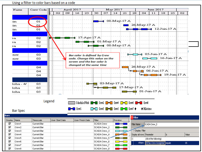 The example above requires you to “Add” a new bar for each Crew.
- Bar Style (detail tab)
- Shape – There are seven options for bar shapes as shown below. The line and thin bars are useful when plotting more than one bar on the same row. You can use various alignments to vary the location of the bars. There are many different types of milestone symbols including blank (no milestone). A word of caution, some of the milestone shapes do not print well and testing is highly recommended. You could combine milestone shapes with filters to coordinate shapes with certain types of milestones.
- Color – Both milestone and bars can be assigned to any color.
- Pattern – There are many bar patterns or hatchings available. This is useful to distinguish bars if color printing is not used. Testing of the display output is recommended for desired results.
- Row – For each P6 activity the plotting “row” is divided into 3 “sub-rows”. The “sub-rows” are labeled “Row “ in the options box where 1=top, 2=middle and 3=bottom. These are used for plotting target, baseline or other comparison schedules. The comparison bars can be a strong graphical feature.
- Preview – There is a preview column at the far right that shows the selected bar style.
Bar Settings (detail tab)
- Group Band Settings – There are two radio button under this heading:
“Show bar when collapsed” means do you want to show a bar on grouping bands. Remember this applies a specific bar that is highlighted on the list. This is a good way to produce a summary schedule with details embedded. For example, if you check this on critical activities it will show just the critical activities in a collapsed group bar. (“Summary bars” as another displayed bar will also impact the output for the grouping band.)
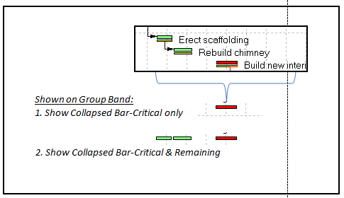
Show bar for grouping bands means you turn the bar into a summary bar only. P6 will change the timescale filter to “summary”. Then the normal bars on activities will disappear. With this option, P6 will show a bar for the group band plotted from earliest start of activities in the group to the last early finish. The color will be the color of the lowest bar on the list that has this option checked. Checking this option means you only want to see bars in the group band. Use this in a layout that is going to show “Summaries Only”.
- Bar Necking Settings (detail tab) – This setting allows you to show more detail in the bar to show specific times of non-work periods. There are two choices for bar necking: Calendar non-work time and activity non-work time. These setting can be applied simultaneously.
Calendar non work time applies to holidays, weekends, shifts or any time period you have on the calendar that is non-work. Thus bar necking will show the period of the non-work with a thinner bar. The timescale must be set to a sufficient width to view the thinner bar. This is useful for a visual display of weekends, shifts or an extended non-work period such as an environmental restriction period. This setting is applicable for default bars (i.e. those that are defined by the default filters) and not for summary bars, user bars or other special bars.
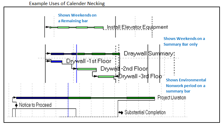
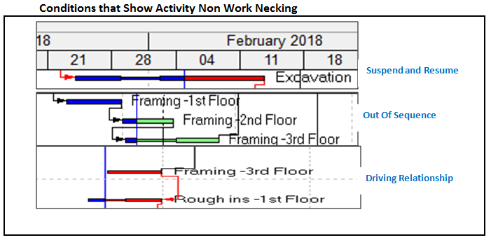
- Activity non-work time applies to activity time between the start and finish date that is not a part of the calculated remaining or actual duration. Thus bar necking will show this non-work period with a thinner bar for a visual display that would otherwise be hidden in the bar graphic. There are several conditions that could result in an activity non-work period such as the time between suspend and resume dates, an out of sequence activity and a driving relationship that forces a date (see below examples).
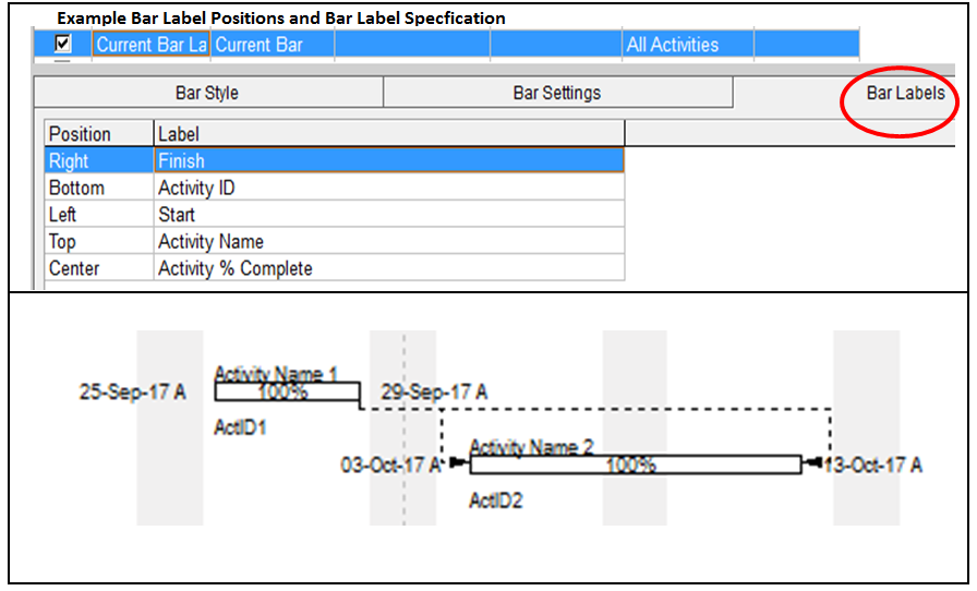
- Bar Labels (detail tab) – This setting controls the position and the data used for the label on the bar. There are numerous options for placement of the label as well as most of the many P6 data fields including system names, dates, costs, codes, user defined fields, notebook topics, etc. These options can create many custom displays. Each bar type can have a bar label. Since bars like actual, remaining and critical are on the same activity, there would be overwriting if a label was on all of these bars. Thus a separate specification is used for the purpose of a label on default bars, called the “Current Bar Label”. This specification has no graphic bar and its function is to locate and define the label for default or “Current Bar”. Other bar types may specify different bar labels and be displayed at the same time, such as summary bars or baseline bars. There is normally a different timescale or filter that defines the activities for these bars. The position and label is set in the “Bar Labels” tab. The example below shows 5 different labels on the same bar each with a different position and each using different data fields. In order to view the top and bottom labels, there must be a larger row height of at least 30 points. The font and timescale settings will also impact the visibility of the labels. If the labels don’t fit, P6 may overwrite labels on top of each other. Other data, such as codes, variances and notebook topics can be used to create a strong and custom graphic. There are other position settings to move/justify labels with one position (i.e. top right).
Using User Defined Bars
The standard P6 bar specifications in P6 offer a wide range of options and are generally satisfactory for many applications. However, one of the most useful bar customizations available is the User Defined Bars option. Examples of User Defined bars are given below for a master or summary schedule and graphing dates that are imported from another system, database or project.
Use the “Add” button at the right of the Bar Dialog Box to add a new bar and specify a bar name. The requirements for Bars using User Defined dates are:
User Defined dates are user defined fields set with a data type as a start or finish date.
Every specification must have a start and a finish even if you are only plotting one.
Plots activities set by a filter.
The filter can be all activities or any new or existing filter.
When plotting user defined dates with other bars on the same activity, the user must define dates properly so there is not overwriting of bars or labels. This is not checked or managed by P6. Refer to the example below for sample settings. Remember, all bar setting are saved in the layout. Unused bars or not-displayed bars can be deleted for simplification of the specification.
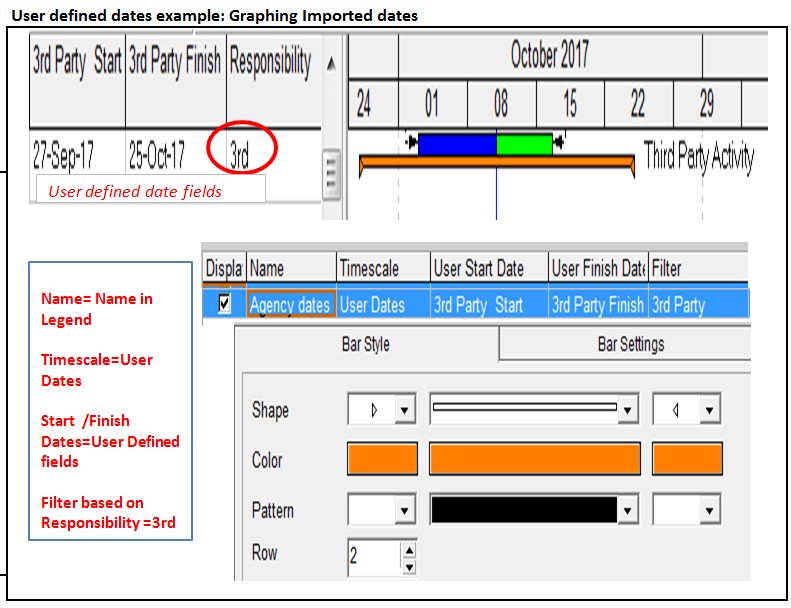
The above example is an application where a third party tracks “window” dates in another system and then these dates are imported on a regular basis to compare the current schedule in P6. The dates are imported (or entered) into the user defined dates shown in the columns above. The orange bar is then plotted for only activities which meet the filter conditions, Responsibility equals 3rd.
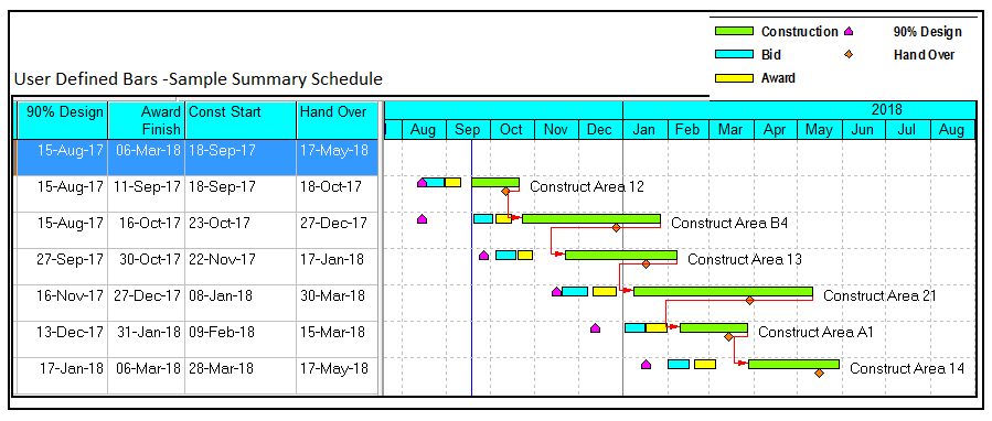
The above example uses user defined dates to create a summary schedule. Each bar is defined by user defined dates and each bar has a separate bar specification similar to the previous example. Similar types of summary schedules can be accomplished in P6 using other methods such as collapsed bars. Each method has advantages depending on the application. In this example, the user defined dates need to be populated by global change, importing or entering from other activities, projects or sources. If this update process is automated, this method can be most effective.